
EasyEats

Role: UX Designer and Researcher
Duration: 1 month
Tools: Figma
Accessibility and Conception

Many online recipes do not take into consideration how the process of cooking may change for people with low mobility. The goal was to create an application and responsive website focusing on helping people with low mobility create home made meals.
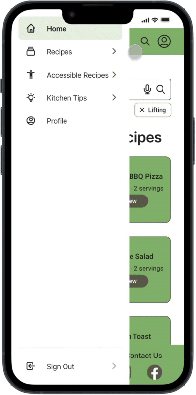
EasyEats is a recipe app and website that allows users to quickly search for dishes that fit their needs. EasyEats allows users the ability to filter recipes directly from the homepage based on their physical capabilities. Users also have the option in this design to utilize a microphone to search through the website. EasyEats aims to provide the ability for users to feel more independent by offering tools to create their own meals.
Empathy, Research, and Design
To better empathize with the users, I conducted interviews and read real experiences people had with cooking. I found that many of the issues people can have when cooking meals at home, including long periods of standing while chopping, holding a knife or other utensils, among other things. In order to address these issues, I wanted to have a section that suggests solutions to these problems and also have the option to buy ingredients pre-chopped if the suggested solutions are not possible.
Through my competitive audit, I found that many recipe websites do not take accessibility into consideration. Similarly, websites that focus on kitchen accessibility lack recipes to implement the tips provided for using different tools. Users are also likely to be using mobile applications to view recipes so they have the ability to view steps while working in the kitchen. However, some users may enjoy printing recipes or viewing them from larger screens. Because of this, I began creating my design using progressive enhancement by starting with the smallest screen size, a mobile phone.
Using this knowledge, I created different paper wireframes for the mobile homepage through the Crazy Eights exercise. I wanted to create designs focused on using voice commands as well as different features beyond the recipes. Following this exercise, I focused on ideas that would also adapt well to other screen sizes.

Responsive Design

I used elements from these different designs to create a low-fidelity home page for the mobile application. In the first iteration of the mobile homepage, I included spaces for recipes that users would like easy access to as well as a search bar that can be utilized with voice or text. A space was also left for articles with advice for creating an accessible cooking experience.
I continued creating the main user flow of searching and viewing recipes. This included the search results, recipe page, and an area for users to view the ingredients like a grocery list as well as the option to have groceries delivered for ease of access. The recipe page includes both a video recipe and written recipe for those who use auditory or visual information to learn. Following this, I created a low-fidelity prototype for my usability study to get feedback before proceeding with my high-fidelity mockups.

After my first usability study, users stated that they would like to have quick filter options under the search bar regarding skills needed to cook the recipe. They also wanted the titles for most information to be visible without having to scroll. Users stated they enjoyed having personalized home pages including their favorite recipes and recipes suited for their needs.

Using this information, I changed my wireframes and started my mockups. I added three main filters to all the search bars and moved elements farther up while keeping in mind Gestalt Principles and ensuring that similar information was still grouped together. After finalizing my designs, I adapted them into different sizes for a desktop, tablet, and mobile website. All versions contain the same content however the tablet version allows users to expand the written recipe and ingredients list. The tablet and mobile versions also include a hamburger menu while the desktop version does not.
Both the mobile application and the responsive website includes a simple user flow for finding accessible recipes. The inclusion of multiple screen sizes allows users to view these recipes from any device so they can use the one that best fits their needs. Users are able to enter the user flow from multiple places. The final designs include alternate text for images for screen readers and contrast was tested for the visually impaired. The voice search was also kept for those who have difficulty typing.
Learnings and Improvements
EasyEats is the beginnings of more accessible recipes geared towards those who would like to create their own meals regardless of any impairments. This can help people feel more independent and proud of their capabilities. In this design I was able to create more components including filter chips. The design also began as a mobile app design and then was adapted to a responsive web design, allowing for practice with progressive enhancement.
In order to further improve this design, I would continue user testing especially within the community this app is designed to help most. This will enable designs that can best benefit the users. Similarly, I would continue developing past the main user flow by adding the articles to the site. This would allow users to view tips which can further assist them in the kitchen. In order to continue developing the rest of the application, I would create a profile page for users to customize their experience by ensuring that recipes and tips that come up are specific to their needs.