
RoofFinder
Role: UX Designer and Researcher
Duration: 1 month
Tools: Adobe XD
Quick Searches

Those searching for a new place to live would like to be able to narrow their search quicker and quickly message leasing agents and landlords. This project aimed to create a responsive website design that allowed users to easily apply filters to find the right place and then enable them to quickly reach out to secure their spot.
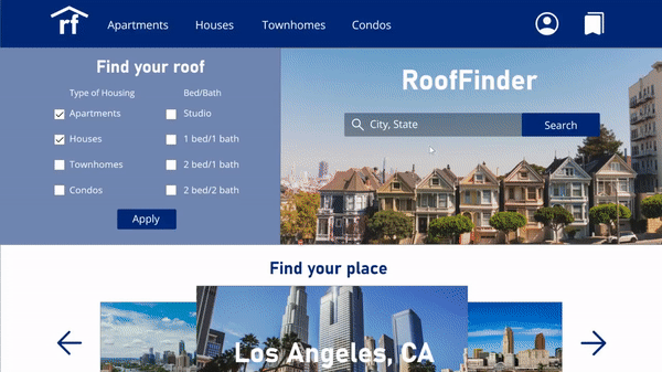
RoofFinder is an apartment searching website that focuses on utilizing filters to help users find their perfect place. RoofFinder provides users the ability to quickly narrow their options and message leasing agents directly without having to leave the site. RoofFinder targets users who are looking to ease the stress of moving to a new home.
User Research
In order to better understand the user base, I first conducted interviews. Based on their experiences with apartment websites, I created empathy maps and personas. While adults of any range may use websites such as this, I found that the primary user group is young adults as they may move more frequently.
During my interviews, this user group stated that one of the most important factors when searching for apartments was the ability to filter to find exactly what they’re looking for faster. One user also stated that messages sent to leasing agents through some websites seem to get “lost”. Based on this statement, a messaging center in a website could help alleviate this issue.

Sketches and Changes

With this information, I crafted paper and digital wireframes including these features to address the user pain points. Through a competitive audit, I saw that many websites did not have the ability to apply search filters from the home page. I chose to directly address this issue by creating focus on both the filters and the search bar.
After combining different elements of my wireframes into my low-fidelity home page, I continued making frames for each of the components of my main user flow - searching for an apartment and contacting the leasing agent. I included the ability to change the filters throughout all of the pages of the site. I also wanted to ensure that the messaging process included screens that made the user feel that their message was received. I used these screens to create a low-fidelity prototype and conduct a usability study with my main user group.
Following my first usability study, users agreed that the search result page had been confusing. I implemented this feedback and reduced the number of apartments that could be viewed on the page at a time. Users also stated that the use of images in this website would be imperative. Therefore, I wanted to ensure that users could interact with these images, including the maps.

Final Touches
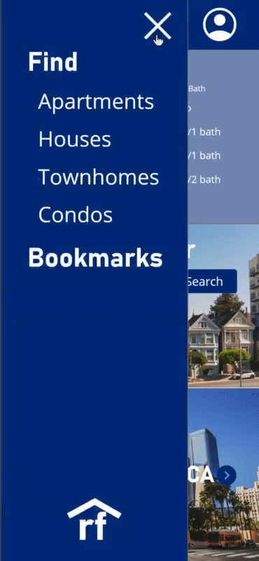
With this knowledge, I began crafting my mockups. I used Gestalt Principles on my homepage to ensure that users would not overlook the filters for the search bar. For my search results, I added an interactive map to show users the location of each rental. After finalizing my design for each screen, I created mobile versions of each screen for the responsive design. This version includes a hamburger menu and drop down map in the search results.

The final high-fidelity prototype of the website includes a responsive design and simple user flow for finding a rental. This design addresses users’ needs for filtering and messaging. Users can also enter the user flow from multiple points. This prototype includes alternate text for images for screen readers, as well as large text and high contrast to aid the visually impaired.
Feedback and Metrics

RoofFinder creates a simple, refined experience for users to search for the perfect rental. During the design of RoofFinder, I learned how to create responsive designs for the web and improve on these designs through each iteration. Following the high-fidelity prototype, a smaller usability study was conducted. Based on the feedback received from that study, to improve the user experience filters for amenities would be added as a feature. In order to continue creating a list of rentals relevant to the user’s needs, the rent option would also be changed to a typed range rather than a drop down menu. More user flows would also need to be created to ensure that users could view received messages and also view saved properties.