
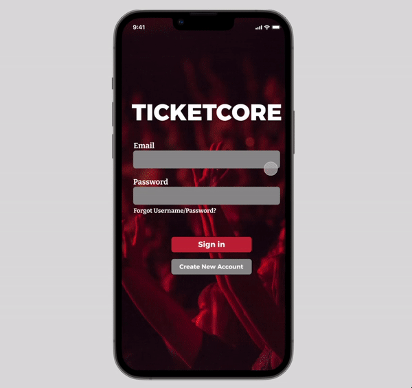
TICKETCORE

Role: UX Designer and Researcher
Duration: 1 month
Tools: Figma
Calm Before The Concert

Concert goers would like to support smaller artists and have a stress free event. The goal for this project was to design an application that allows users to choose events they would like to attend and also provide them with all the information they need prior to the concert.
TICKETCORE is an online ticketing application catering to small punk rock shows. TICKETCORE aims to deliver unique experiences by creating an easy checkout process. TICKETCORE targets those looking to see artists while having access to all the information they need for their show.
User's Taste
I conducted interviews and made empathy maps to better understand users and their needs to create better designs. A primary user group I identified through my research was busy college aged adults who enjoy fun experiences with friends.
This user group confirmed that users would like information to be readily available to them, but that it was not the only factor that frustrated users when trying to find tickets. Other problems included distance, size of events, and cost.
Producing A New Product
Following this, I began creating wireframe solutions to address these user pain points, starting with the home screen. Drafting iterations of each screen of the app on paper allowed me to ensure that each element would flow while still addressing user pain points. For the home screen, I prioritized search functions and app accessibility so users can find the events they want.

Using information about competitors that I learned through my audit, I continued creating digital wireframes for my main user flow - ticket purchasing. I included a visual seating chart and written description of the seats in comparison to the stage. I also wanted to include the event information for the user to view prior to completing the transaction. Then, I conducted a usability study using this low-fidelity prototype.

From my first round of usability studies, I found that I needed to include more visual information as well as decrease the amount of total information on my home screen. After implementing this feedback, I conducted a second round of usability studies. Users felt that the confirmation screen had too much text and that they preferred a pop-up/overlay rather than a separate screen. I also made sure to conduct these studies with a wide range of participants, including those with different forms of colorblindness. From these users, I learned that some of the buttons were lacking visual contrast and therefore were difficult to differentiate from the background.

To address the findings from my usability study in the mockup, I made the home screen less cluttered and made multiple changes on my confirmation page. To reduce the feeling of the screen being “crowded”, I made the decision to no longer have images on this screen. For accessibility, I also increased the text size and added more contrast to the buttons.
The final high-fidelity prototype presents a cleaner, less cluttered user flow for purchasing a concert ticket. It also meets user needs for filtering, seat descriptions, and other information users would need to know prior to attending and enjoying their events. This prototype also had multiple accessibility considerations including detailed alternate text to images for screen readers, icons for easier navigation, and high contrast for buttons to aid users who are visually impaired.
Showtime And Post-Show
TICKETCORE provides a more detailed oriented experience for users to make them feel less stressed for their fun events.

"Simple. Easy to use. Layout looks great. No real critiques here. Simple and easy are good!"
While designing the app for TICKETCORE, I learned how to make iterations on initial designs for continuous improvements. Usability studies and peer feedback helped influence each iteration of this application, as well as research from a competitive audit.
To continue improving this design, I would conduct another round of usability studies to confirm that all user pain points have been addressed and in order to determine if there are any other user needs. Following this I would create more user flows based on that feedback, including viewing paid tickets and information for those events.